Monday, September 27, 2010

Comic Book Cover Character Ink Progress

*Mild applause, some guy coughs*


Here's what little bit I got done with the character inks on this project. As I've said, it takes me forever to get decent muscle placement, plus I got a commission from a relative that's jumped to the top of my Stuff to Draw list. So I got about three hours of work done in one week.

I was pleasantly surprised with how the guys robo arm came out. I want it to have a metal sheen, but the parts that are supposed to be highlights also kinda look like bubbles, as if his arm is made out of some kinda liquid in a clear casing, which might be more interesting. I'll hafta see what I can do with it when I get to the coloring stage.

Monday, September 20, 2010

Comic Book Cover Background Ink

Might as well put in the bat symbol spotlight.


Didn't get much finished last week. But since I feel that I should have something to show both my readers every Monday, here's this thing. I tried to make it a habit to not use the Photoshop shift click trick too much, as I wanted the lines to look rough as if it were actually inked.

The buildings toward the back don't have much detail. I figured I shouldn't waste too much time on them since the characters would cover up most of them.

That, or I'm lazy.

Probably lazy.

Sunday, September 19, 2010

Belle

But probably not the Belle you were looking for.


Another sketch of one of the characters in the Scary School pic. She's a little ghost who's name is Belle, and she has a bell! HA!! You see what I did there?

She was created mostly cuz I wanted a cutesy little mascot for the group. Story wise, even the gang doesn't know her origin or how she died because she doesn't talk, either because she can't or chooses not to.

I remember when I first started thinking about her design that I wanted to her to have a cut noose around her neck, but I figured that be a little much, and it also implies that her death was caused by suicide, which I don't like for her character.

Monday, September 13, 2010

Comic Book Cover Sketch

I actually burned a hole in the paper.


Well, this project is gonna take even longer than I thought. Maybe as long as it took me to do the Scary School piece. Like I said before, I'm not used to drawing muscular hero types, so it takes me forever to get them to look right.

In the last post on this project, I had a sketch of the main villain who's head was gonna inexplicably be floating in the sky, but I decided against that. I figured I should try to draw it as a professional would, with about 2 inches worth of free space at the top where the comic title would go. Idano if I'll actually make a title for this fake cover or not. I gotta think of a name first.

Hmm... Based on the art, it's a comic full of these heroes knocking the f**k out these typical henchmen guys... So how about calling it STFU? ...Nah...

GTFO? ...Meh...

I Hate You, You're Ugly, and I'm Gonna Punch You? ...Maybe...

Tuesday, September 7, 2010

Bob & Tom: General Static Contest FAIL

But my mom says it's the best!


Okay, so I didn't make the finals in the Bob & Tom CD art contest I mentioned earlier...


Oh well, at least that means I can do a proper post on it. It's the typical drill sergeant yelling at the troops thing, which may be why I didn't make the cut, as that's pretty typical for army themed stuff. For those not familiar with the radio show, Bob is the general yelling in Tom's face, with Kristi Lee to his left and Chick McGee on the right.

And while we're on the subject, go ahead to the art contest web page and vote for your favorite. I think number 4 is best of the bunch.

Monday, September 6, 2010

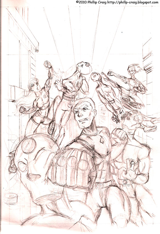
Comic Book Cover Characters

Grimaces and steroids.


For my next project, I wanna do artwork for a fake comic book cover. No problem I figured, but then I realized I had to work out the look of the characters first. Then while doing that, I realized I'm still not so great at drawing muscular super hero type characters, so it took me much longer than I would've wanted to. As you can see, the design isn't anything terribly original (the main guy has the Superboy look), but it took me a while just to get the correct muscle placement. I have to constantly look at references to make them right.

I also didn't really bother with names, with the heroes simply being called One, Two, and Three. I gave each of them cybernetic body parts to give me a reason to do a shiny metal render when I color it, so maybe they're experiments who's creator didn't care for them enough to give them proper names. ...Sounds like me! HA!

Then we have the masked produce henchmen who have very little detail on them, since I'll have to draw a bunch of them on the cover, and the main villain, who of which I may super impose on the sky looking menacingly down upon the heroes or the reader. If I have room for him, that is.

These may not be the final looks. I don't like Two's eyes very much, and I might change the villain's hair style to something more... idano... villainy. Or maybe not. Whatever happens, happens.

Sunday, September 5, 2010

Coming Together 2

Sequel to the hit that nobody saw.


Here's the claymation sequel to that other animated short I did in college. This one was, surprisingly, for a ceramics class. I originally was gonna do it in 3D, but then discovered that would pretty much impossible, seeing as Red and Yellow have floating limbs that aren't actually connected to the body.

Although clay is a little messier, I liked it more than paper cut outs as a medium, as it let me do the free form blob and add squash and stretch effects to Red and Yellow.

Now I gotta learn how to use Flash to make this into a trilogy.

If you'd like a bigger screen, here it is on Youtube.

Monday, August 30, 2010

The Stylus is Mightier than the Sword

Please don't take this as an excuse to stab people with styluses.


Here's the second and last project for the magazine idea. Even though the glove was hand drawn first, I wanted everything else done in Illustrator. I'm not exactly dying to do magazine layouts as career, but it's nice to see what I can do if that opportunity should arise. If nothing else, I guess this could be a good portfolio piece.

Wednesday, August 25, 2010

Bob & Tom: General Static contest

We salutes you.

The above link will take you to the facebook page of Bob & Tom's art contest for their next USO themed CD, General Static. My project for last week was a submission for this. There's more artwork than what's posted, so the pics shown may change. If it's still there, mine is the one wear Bob is playing the role of General and is yellin' in Tom's face. Here's the direct link to mine if it makes it any easier.

By September 7th, they'll have the finalists and people can vote for they're favorite. I, of course, hope I win, but out of this batch, I think Fosgitt's will come out on top. I shoulda known to use sex appeal in a Bob & Tom themed piece.

I mean, c'mon! Boobies! How could it not win?!

Sunday, August 22, 2010

Casual Samantha

I like short shorts. ...Not wear them, mind you.


Not much this time, just another sketch of Samantha. I was imagining what she might wear when she's not wearing the dark grey school uniform. Cute enough. I may do that with the rest of the characters someday. Although I imagine Reason wearing formal stuff even when he doesn't have to.

Monday, August 16, 2010

Phillip's Magazine

Extree, extree, read all about it!


Am I selfish? I coulda made up any theme for this fake magazine cover, but I just made it my magazine. And it's my blog. And almost all the comics I've made focus on me. This is why I need a girlfriend and more friends in general, so there can be more interesting people and situations to draw inspiration from/make fun of.

I have plans to do a layout for the first two pages of "The Stylus is Mightier than the Sword" article that's advertised on this cover. I think I'll make the illustration for that more designish, something that'll be made in Illustrator. I hafta sorta make myself use that application if I wanna get better at it, seeing as I prefer pixel based Photoshop.

Monday, August 9, 2010

Phillip's Magazine Illustration

Magazine part to come later.


Here's another project that I was so sure I could finish in a week, then failed miserably at doing such. I want to make a fake magazine cover so I could mix design and illustration, that latter of which being all I got done. Didn't help that I had to work everyday last week. And I may have to this week too.

...OOH! I keep forgetting that means more money for me! CHING, CHING!!

Anyway, in this fake magazine, the top article will be an interview between me and John, hence this illustration. As you can see, it's riveting.

Monday, August 2, 2010

Too kind

If there is such a thing.


As this comic points out, I'm pretty much a douche to all my neighbors in Animal Crossing: City Folk unless they're from my old Wild World town. Even though there are a ton of different animals, there's only a handful of personalities. So if you have one cheery girl, you essentially have them all. But I don't care. I want Peanut.

This comic also implies I don't like compliments about my art stuff, which is not true, unless your an animal I don't like. I'm usually very thankful for kind words.

I often draw myself in a bunch of different shirt designs, but the Watchmen design Nana and I are wearing in the comic is actually the only one I've ever bothered to make in the game:


Cue Nat "King" Cole's "Unforgettable."

Monday, July 26, 2010

So I sez to Mabel, I sez...

She likes Mickey. Can't you tell?


Here's Mom's requested drawing to put on her phone, as well as the phone of anyone else who wants it. When Dad asked for a drawing of him, I immediately got an image in my head. Screw whatever he had in mind. But for Mom's, I asked how she wanted it to look, and she said she just wanted her talking on the phone and holding a Mickey Mouse coffee mug. Oh, and Mickey earrings too.

And now for something partially related.

My parents celebrated their 29th anniversary yesterday. 29 years! Most celebrities think that stories of marriages that last that long are just fairy tales.

Sunday, July 25, 2010

Loid

Not that kinda loid.


Yet another character from the Scary School pic. He's a friendly little monster boy that has the power to shape shift, and he usually does that by sorta multiplying parts of his body so they become big jumbled messes of whatever the body part is, like you see in the last two sketches. Think Akira, but more creepy and comedic than horrendously disturbing. Since doing that with his teeth and jaws is rather dangerous to those around him, he's been given a pacifier to... uh... pacify with.

He lives with Samantha, who considers him a younger brother, but in a way in which an only child who suddenly gets an adorable little boy to take care of would. So thus she spoils him rotten and he tends to like her more than the others in the group.

I also said in the notes that he likes to act like different animals but doesn't always necessarily turn into them, which I just thought might be cute and funny, seeing as he's a kid. Based on the life span of his particular species of monster, he's a toddler, but in human years, he's centuries old.

Monday, July 19, 2010

Is Your Computer Even On?

...Okay, then turning it on first might help.


Here's a pic Dad asked me to make to put on his and Mom's iPhone, in the same vein of those drawings I did of John and I. Mom asked me to do one of her as well, so hers will be next week's project.

I drew Dad as he often looks when someone calls him about their broken computer and he has to decipher what horrible/stupid thing they've done to it so he can find out and tell them how to correct it. Family members are always calling him about fixing their electronics. I think he should charge them.

...OOH! Maybe I should charge family members for commissions like this! This hobby just got interesting...

*UPDATE*

Edit by John:

Sunday, July 18, 2010

Red and Yellow Vs. Green

FIGHT!


Here's more artwork starring the Paint Guys Red and Yellow and some big green monster dealie. This was for advanced painting, so it was made closer to the end of my time in college. I was thinking of what it'd be like if they were in a game, so they're on a 2D plane, which is also how I did their animated short. I gave it a hellish landscape to sorta juxtapose the cuteness of the Paint Guys. That, or I had been playing Doom 3 recently.

Detail shots coming...... now:


Monday, July 12, 2010

Blog Sign

I has one.


I made this after getting jealous of other bloggers having custom images for their blog titles. It was created in Illustrator, cuz, I mean, c'mon! I'm not gonna make a bunch of squares in Photoshop! I didn't wanna make the frames in Photoshop either.

*Rim shot*

Starting at the top left and going clockwise, the characters are Me, Dad, Samantha, Reason, Moose, Hopper, Animal Crossing version of me, Mr. Resetti, Yellow, Red, Mom, and John. I was thinking of putting Bob in there, but decided to only put characters that have been featured more than once.

Also, we all hate Bob anyway.

Sunday, July 11, 2010

Thanks, Sora

I'd by a portrait of this from Disney World.


Seems I drew this in 2007, so it ain't too old. Like everyone else who plays games and doesn't hate Disney, I rather like Kingdom Hearts. I think this is the only fan art I've ever drawn for that series. I tried to make it resemble that famous painting of Mickey shaking hands with a firefighter:


Looking at the sketch now, I find it hard to decipher the hands that are in process of shaking... the other person's hand. It's a jumbled mess, thanks to the chain coming off the end of Sora's keyblade. I shoulda had him holding it at a different angle, or just take it out completely.

Monday, July 5, 2010

The Bebop Brothers

Vicious is an Illinois Nazi.


I got this idea in my head several years ago, but it sorta went away, then I got hit in the head with a bowling ball and it came back. I tried to make the image resemble this:


The Blues Brothers often reminds me of Cowboy Bebop and vice versa, I guess because of the music and the nonchalance both groups have about the crazy stuff they get into.

I considered replacing the Blues Mobile with Spike's Swordfish, but I'm quite bad a drawing vehicles, whether they're realistic or not, so I wussied out and just drew a silhouette of the Bebop in the background next to the inexplicable construction stuff. I also went back and forth on how to render the characters, eventually choosing to do simple cel shading, since most official Cowboy Bebop images, even promotional stuff, are done that way.

And for those who hate Blues Brothers 2000, here's one with just Spike and Jet: